Monday, March 21, 2016

The Dining Room

Once again, I failed and getting pictures of the true nature of what this room looked like at the start of it all but here is what I've got...

 
Getting the last of the carpet out.


Lots of junk and dingy walls.


You know... putting holes in plaster when you rip out a curtain rod without thinking about whether there would be an anchor in the wall or not.

 
Patches, finished ceiling, starting on wall color along baseboards and in corners.


#nopainterstape

 
New wall color (SW 7022) and Extra White trim.
 
 
These were definitely the most beat up floors in the house. Character, right?

 
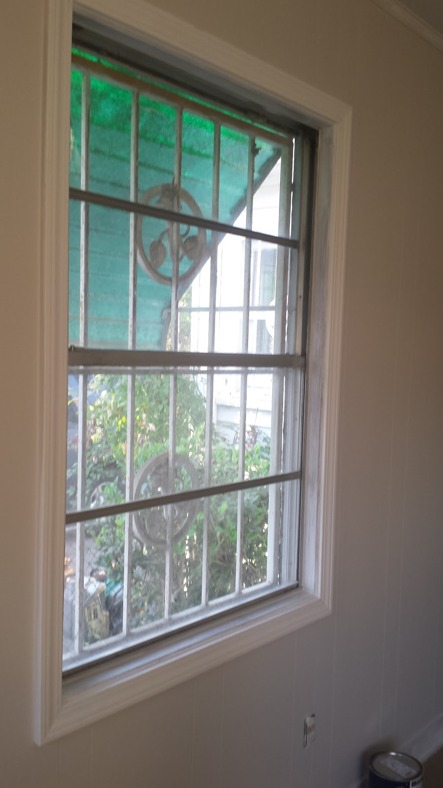
The goal is to get all of the old wood windows in the house working again...thus the fact that I have left them unpainted. Some day I'll get to it.

 
I lied...the last of the carpet is under the grandfather clock but I will not be attempting to move it by myself!

 
Here it is... the room is clean and open. Still have the longer list of things like new dining table, artwork, etc. but this room has come a long way from where it started.

Thursday, February 4, 2016

Using Neutrals, A Defense.

I've had this question posed to me on several different occasions so I thought I would take the time to thoroughly answer it , that question being: Why aren't you using any color in your design?

Firstly, who decided that plain walls were such an atrocity that we had to go around painting dining rooms red and kitchens yellow, and bathrooms blue? Who? Tell me now! Why is there such a demand for accent walls and bright curtains?

Secondly, I've always been a girl that has loved black and gray and white-- look at my closet, it's about 70% of what I own. I also love metallic: gold, silver, rose gold, pewter, bronze, copper, pearlescent whites. When it comes down to it, if these are the things that I like, why would I use anything else?

Now regardless of my clothing preference, I am here to defend a neutral palette in home décor.

Neutral is classic. It will never go out of style. I think of items I've purchased in the past, turquoise pillows, multicolored rug, bright artwork and within 6 months I was over it and wanted something new. I did a little experiment when I lived in my apartment- one week I went out and bought all kinds of new accessories for my place, all neutrals and metallic in varying shades and warmth and luster. I never loved my place more and I went 2 years without changing it. So by making the decision to maintain a neutral palette, I hope to love this home just as much.

Neutral is calm. I work around kids. My classroom is full of bright colors that I consider energizing and fun. See...


 I don't want that when I get home. I want to walk in the door and immediately feel calm, colors and textures have an amazing way of doing that. Color, creates and reflects feelings.

(These are not my words)- From a color psychology perspective, gray is the color of compromise - being neither black nor white, it is the transition between two non-colors. The closer gray gets to black, the more dramatic and mysterious it becomes. The closer it gets to silver or white, the more illuminating and lively it becomes. Being both motionless and emotionless, gray is solid and stable, creating a sense of calm and composure, relief from a chaotic world. The color gray is subdued, quiet and reserved. It does not stimulate, energize, rejuvenate or excite.

Now, that last part was a bit harsh but I guess it's true and I suppose it depends on your personality. Yellow is supposed to be a color of excitement, right? Well, I find yellow slightly repulsive. (Yes, I know that the background of this blog is now a yellow paint roller. Shut up.)  Quiet and reserved, is how it's described--that is exactly what I want to be in my home.

Neutral is inviting. I find a lot of bold colors to be garish. I don't necessarily want to spend time in a space that doesn't make me feel invited. Do you think about cozying up with a book in a bright orange, pink, purple, emerald green room? Neutrals are just that, they are not offensive. They have an element of warmth and calm that other colors and non-colors cannot match. Neutrals are cozy, calm, warm, and clean. They provide a richness and air of sophistication without having to try too hard.

Neutral is bold. Think about it. I can buy things in all sorts of crazy patterns, textures and sheens that will all go together because there are no clashing colors. Tweeds, knits, furs, velvet, linen, chenille, geometric, floral, abstract, animal print- everything is fair game. Far from boring.

Neutral allows the important things to stand out. I was given a great gift and responsibility in restoring this house. My grandparents had so many amazing things--just wait until I get my on displaying some of the family photos that have been recovered in this cleaning out process. I am proud of most of the things I have and I would rather those be seen than a couch or a wall. Pictures, dishes, furniture- those are what tell a story about a house. I want my family to be able to come in and openly see the things that have been hiding for years. More importantly, the atmosphere needs to be one in which the people that come by are the ones who stand out, not the stuff around them.

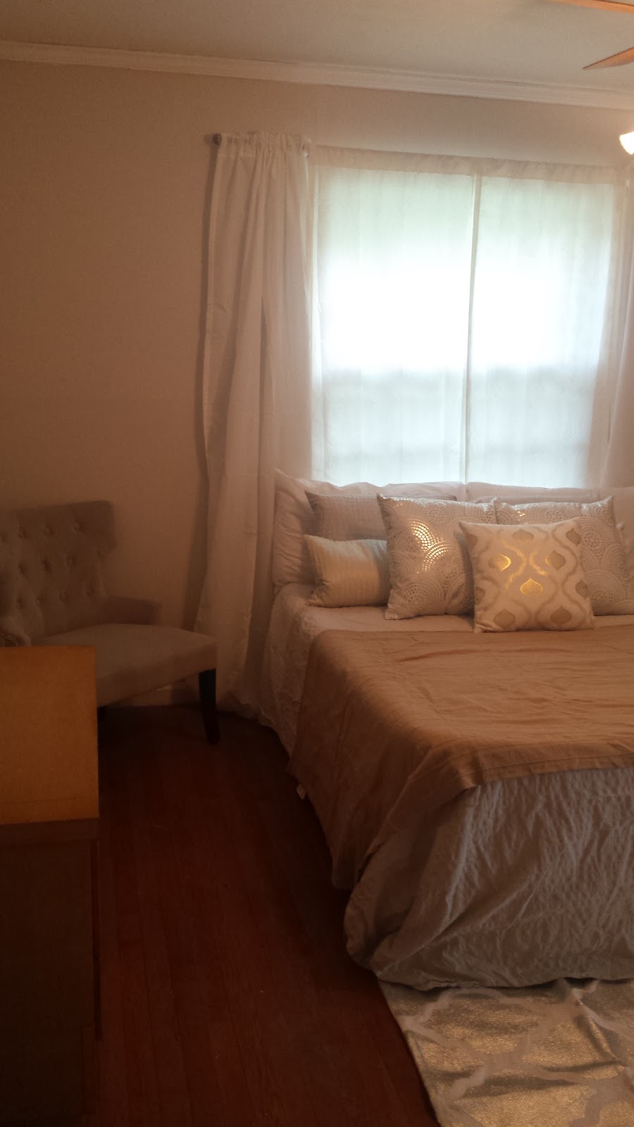
Just in case you still doubt, ask yourself this would you have a problem coming home to this bedroom? Didn't think so. Case closed.

Wednesday, February 3, 2016

The Den

I messed up and didn't get any real before pictures on this one-- I will see if I can dig up a pre-existing one somewhere.

There is a laundry list of things happening in the den-- it was actually more of a cave. Really dark paneling, heavy window coverings, etc.

There is a laundry list of things happening in here:

Sheetrock repair
Paneling is being sealed and painted
New doors to the bedroom and bathroom
Windows and doors are getting trim to match the existing trim in the rest of the house

This is the room with a coat of primer- imagine that everything used to be dark brown.


Windows in the den now have trim around them! Since the back part of the house is an addition, it did not have the same details as the original. I had my contractor frame out all of the windows and doors so that it feels like a continuation of the house and not an addition.


Excuse the mess, just look at the framed case opening!
 
 
This is the first coat of the actual 'color' - Simple White (SW7021)
 
Instead of the 'Den', I now dub this my 'Sunroom'-- probably needs a few more windows but whatever.
 
 
Tada! This hallway was cramped with video shelves, there was no framing around the doors and everything, walls and doors were dark brown.

 
The den is now a bright, open living space. Done in a week! Hooray for amazing contractors-- if you are in Houston and need painting or remodeling services, hit me up for my guy's info!
 
 
Still in need of finishing touches and décor, but I could not be more thrilled with how this room is coming along!


When none of your wine is 3 Buck Chuck...you feel like an adult.


Tuesday, February 2, 2016

The Study

 
The process of cleaning out the study has been...dusty to say the least. I am most excited about finding some amazing old books and uncovering all of the scrapbooks and photo albums that my Grandfather had stashed away in various spots and making them once again accessible for the family to look at and enjoy.
 
 
Here we have a Men's Choir book from 1888.


Book of Concord circa 1940

 
A pamphlet on the evils of dancing.

 
LIFE Magazine Issue circa 1971.
 
Right now, the study has a desk in it--I'm going to be changing the feel of it and turning it into a library complete with sofa and ambient lighting.
 
Here is the current situation-- A lot of books and a lot of dust. What you're seeing is after I've packed up 7 boxes worth of books!


After a weeks worth of sorting, packing, and tossing the office is cleaned out, ready for painting and carpet removal.


Even after the things being given away were taken care of, it took a long time to get every book sorted and arranged.


Behold, one final discovery... "Celebrating the Musical Heritage of the Lutheran Church". A six CD collection.


Last bit of carpet that this built-in is sitting on top of... cut most of it out, now to figure out how to cover the remainder up.


We've gone from completely full shelves, two desks and two filing cabinets in this tiny space to this- one desk and an appropriate amount of books and knick knacks!

Monday, February 1, 2016

Progress, or Lack Thereof.

Alright Friends,
I know, I know--it's taking me forever to get up any new posts. Let me explain, not only did the holidays kind of bring a halt to a lot of home improvements, you know with parties and family gatherings but also as a musician and music teacher Christmas is a crazy busy time with concerts and church services! Around Thanksgiving, my Gramps fell and broke his leg. After weeks of prep for surgery, surgery, attempts and rehabilitation, it was time for him to be called home to heaven. As you can imagine, it's hard enough working on a house that is technically not yours. Even harder when that house is attached to so many memories of someone you just lost. Gramp's study is the last part of the house that I have yet to clean out and I'll be honest, the first time I was in the house after the funeral, I sat in the office and cried. I've also made the decision to cut my work load a bit and have a contractor come
 in and do some of the bigger projects that I have been absolutely dreading, such as the den full of beautiful 60s paneling and the living room/study. So you may look forward to those changes happening much more quickly than I could ever get to them working on rooms one by one.
I will still be putting up before and after pictures and will still be doing all of the décor myself.
Anyways, I hope this will be then end of the radio silence on the progress of the house and that things will start to move quickly from now on! If you are interested (I know they are not the highest quality) you can read through the obituary from the funeral if you want to know more about the super amazing person that my Grandpa was!


Tuesday, November 10, 2015

The Peach Bathroom

Peach Bathroom...Yeah, lets change that.
 
The bathrooms in this house...while functional, leave much to be desired.
 
 
PEACH. While, not my least favorite color-- It does not necessarily complement the neutral chic, calm aesthetic I am aiming for throughout the house.
 
 
While most of the house will be the color on the left, I decided to be bold in my color choice for the bathrooms- Sherwin Williams "Backdrop" (7025)
 
Dark? Yes, but the key is balance, the dark color will not feel overwhelming when the wainscot, cabinets, and shelving is all white.


Here we are, Peachy Pie.
One of the things that I have always loved about this house is the hexagon floor tile in this bathroom.
It would break my heart if some dummy were to ruin it.
 
Plan: The wainscot, cabinets, built ins will all be stripped, sanded, primed and painted white.
Above the wainscot will be the dark "Backdrop" color.

Edit:


Coat of primer on the built-ins, and wainscot! It already looks so different!
I know it's partially the angle but I think it looks bigger and more open with the white paint.

 
First coat of color! My contractor says -- "Dang this paint is dark, are you sure about this?"
Absolutely.
 
 
 Here it is! All zen and clean. I love that the old hex tiles really stand out now!
Eventually ,the tub will be getting refinished as well (you can't see it right now). So glad this one's done and I had to do none of it! Money gets things done, haha!

Thursday, October 29, 2015

The Middle Bedroom


Grandma loved her cards and newspaper clippings! I filled two whole storage containers with those items and photos alone...holy cow.
 
 
As I update this post, you'll see the progress of the middle bedroom  that I'll be turning into the guest room.
 
Gotta get some before  pictures...we're talking baby blue walls and forest green commercial carpeting. Yum.


Before.


Starting to take out the carpet.

 
This is the dirt that was under just one section of carpet. Nasty.
 
 
This room became the 'catch-all' for a while -- thus progress was halted for about 4 months!


I don't think there were enough knick- knacks ;)
 
 
 After! -- I will get a few more pictures in here. As you can see, a guest room someone would actually want to be a guest in. (SW7021) Simple White wall color and Extra White trim and ceilings.